Landing Page Optimization Checklist: 8 Key Actions for 2025
Last Updated

Why Your Clicks Aren't Converting and How to Fix It
In pay-per-click advertising, driving traffic to your site is only half the battle. If those clicks land on a page that doesn't convert, you're essentially pouring your advertising budget down the drain. An unoptimised landing page is often the silent culprit behind a disappointing return on ad spend (ROAS). It creates friction, confuses visitors, and fails to guide them towards the desired action, whether that's making a purchase or submitting a lead form. This is where a methodical approach becomes crucial for businesses of all sizes.
This comprehensive landing page optimisation checklist provides a structured, actionable framework to transform your underperforming pages into high-conversion assets. We'll move beyond generic advice, offering detailed strategies from A/B split testing and headline optimisation to mobile responsiveness and social proof integration. You will learn precisely how to refine each component to maximise its impact. Mastering these core actions will be the key to unlocking your campaign's true potential, ensuring every element of your page is purposefully engineered to turn visitors into valuable customers and generate tangible results.
1. A/B Split Testing
No landing page optimisation checklist would be complete without A/B split testing. This is a fundamental, data-driven method for improving performance. A/B testing, also known as split testing, involves creating two or more versions of your landing page (Version A and Version B) and showing them to different segments of your audience simultaneously. The goal is to determine which version leads to a higher conversion rate or better engagement.
By isolating and testing individual elements, you can scientifically measure their impact on user behaviour. This removes guesswork and allows you to make informed decisions backed by real user data. For instance, testing a bold headline against a more subtle one, or a green call-to-action (CTA) button against an orange one, can reveal surprising insights into your audience's preferences. Success stories, such as Basecamp increasing signups by 30% simply by reducing form fields, highlight the power of this systematic approach.
How to Implement A/B Testing
Executing a successful A/B test requires a structured process. Tools like Optimizely, Unbounce, or VWO make splitting traffic and collecting data straightforward, but the strategy behind the test is what truly drives results.
- Test one element at a time: To get clear, unambiguous results, only change one variable between your control (Version A) and your variation (Version B). Testing a new headline and a new button colour simultaneously will make it impossible to know which change caused the performance shift.
- Focus on high-impact elements first: Start by testing elements that have the biggest potential influence on conversions. This typically includes your main headline, primary call-to-action, hero image or video, and form fields.
- Ensure statistical significance: Don’t end a test prematurely. You need a large enough sample size and a long enough duration (ideally a full business cycle) to ensure the results aren't just due to random chance. Most testing platforms will calculate statistical significance for you.
- Document everything: Keep a detailed log of every test you run, including your hypothesis, the variations, the results, and your conclusions. This creates a valuable knowledge base for future optimisation efforts.
The following infographic illustrates the fundamental workflow for a structured A/B test.
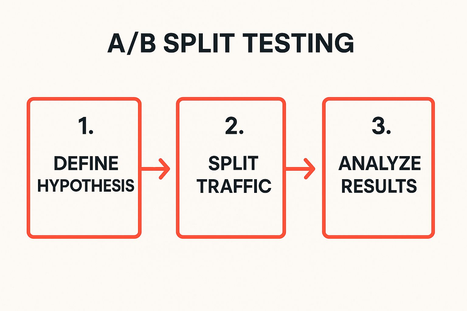
This process ensures that each test is built on a clear objective and delivers actionable, reliable data for decision making. Furthermore, to accurately measure which version drives more conversions, it is critical to have robust tracking in place. You can learn more about setting up accurate conversion tracking for your campaigns to ensure your A/B test data is reliable.
2. Above-the-Fold Optimisation
A crucial part of any landing page optimisation checklist is focusing on what users see first. "Above the fold" is a term borrowed from the newspaper industry, referring to the content visible on the top half of a folded newspaper. In the digital world, it’s the portion of your landing page that a visitor sees immediately upon arrival, without having to scroll down. This initial impression is your single best chance to capture a user's attention, communicate value, and persuade them to stay.
Optimising this prime real estate is non-negotiable because it directly impacts bounce rates and engagement. If your most critical elements like your headline, value proposition, and primary call-to-action (CTA) are hidden below the fold, many users will leave before ever seeing them. Success stories demonstrate its power: Dropbox famously increased signups by 10% with a simple, clean above-the-fold design, while Crazy Egg boosted conversions by 21% by featuring a compelling heatmap demo in this space.

How to Implement Above-the-Fold Optimisation
Effectively optimising this area means being strategic and ruthless with what you include. The goal is clarity and immediate action, not cramming every piece of information into a small space. This approach, championed by usability experts like Jakob Nielsen and Steve Krug, ensures your key message is delivered instantly.
- Prioritise your core message: Your headline, sub-headline, and a concise value proposition must be instantly visible. Answer the user’s question: "What’s in it for me?"
- Place your primary CTA above the fold: Don't make users hunt for the button. Your main call-to-action should be prominent, clearly labelled, and positioned where it can't be missed.
- Use a compelling hero shot: A high-quality image or short video that shows your product in context or conveys a key benefit can significantly increase engagement.
- Minimise distractions: Remove unnecessary navigation links, social media icons, or other elements that could draw attention away from your main conversion goal.
- Test across different screen sizes: What is "above the fold" varies dramatically between a large desktop monitor and a small mobile phone. Use browser testing tools to ensure your critical elements are visible on all major devices.
3. Call-to-Action (CTA) Button Optimisation
The call-to-action (CTA) button is arguably the most critical element on your landing page. It's the final gateway to conversion. CTA optimisation involves strategically designing, wording, and positioning this button to maximise click-throughs. It moves beyond just having a button; it focuses on creating a compelling, psychologically-driven reason for a user to click, transforming a passive visitor into an active lead or customer.
Effective CTA optimisation considers colour, size, shape, text, and placement. It ensures the button stands out from other page elements while clearly communicating the value of the action. For instance, HubSpot famously increased conversions by 21% simply by changing generic button text from 'Submit' to the more value-oriented 'Get My Free Ebook'. This highlights how a small tweak, informed by user psychology, can significantly impact your campaign's success and is a crucial part of any landing page optimisation checklist.

How to Implement CTA Optimisation
Optimising your CTA requires a thoughtful approach that combines design principles with persuasive copywriting. The goal is to make the desired action both obvious and irresistible.
- Use strong, action-oriented text: Replace passive words like 'Submit' or 'Enter' with compelling, first-person action verbs. Phrases like 'Get My Free Quote', 'Start My Trial', or 'Reserve My Spot' are far more effective because they clearly state the benefit the user will receive.
- Create visual contrast: Your CTA button must be easily noticeable. Use a colour that contrasts sharply with your page's background and surrounding elements. While there is no single "best" colour, high contrast is the key principle. Ensure the button doesn't just blend in.
- Consider size and placement: The button should be large enough to be easily seen and clicked, especially on mobile devices, without being obnoxious. Place it logically where a user's eye would naturally go after reading your value proposition, such as below the main headline or at the end of a form.
- Add urgency or scarcity: Motivate immediate action by incorporating time-sensitive language near your CTA. Phrases like 'Limited Time Offer' or 'Only 3 Spots Left' can create a fear of missing out (FOMO), encouraging users to click now rather than later.
4. Form Field Optimisation
Your form is the final gateway to conversion, and any friction at this stage can significantly hurt your results. Form field optimisation is the process of streamlining the data collection experience to make it as effortless as possible for the user. It involves strategically reducing the number of fields, clarifying labels, and removing any barriers that might cause a user to abandon the process. The goal is to get the necessary information without overwhelming or deterring your potential lead or customer.
The impact of a well-optimised form is profound. By asking for less, you often receive more. For example, travel giant Expedia famously increased annual profit by $12 million simply by removing one optional field, 'Company', from its booking form. Similarly, ImageKit saw a 120% improvement in signups by switching to a single-field email capture on their landing page. These successes underscore a core principle of landing page optimisation: every field you add increases cognitive load and potentially decreases conversions.
How to Implement Form Field Optimisation
Optimising your forms goes beyond just deleting fields; it requires a thoughtful, user-centric approach. The aim is to create a seamless and intuitive data entry experience that feels quick and easy.
- Ask only for essential information: Scrutinise every field. Is this piece of information absolutely critical for this initial conversion? If you can get it later in the customer journey, remove the field. For a lead magnet, an email address might be all you need.
- Use smart defaults and auto-fill: Pre-populate fields where possible (e.g., country based on IP address) and enable browser auto-fill to save users time and effort. This simple feature makes completion much faster.
- Implement inline validation: Provide real-time feedback as a user fills out the form. Let them know immediately if a field is correct (a green tick) or incorrect (a red box with a clear error message), rather than waiting until they hit 'submit'.
- Logically group related fields: Organise your form into logical sections, such as 'Contact Information' and 'Shipping Details'. This makes the form appear less daunting and easier to process mentally. For longer forms, a progress indicator can also help manage user expectations.
5. Social Proof Integration
No landing page optimisation checklist is truly effective without considering the psychology of the user. Social proof integration is a powerful technique that leverages the principle that people are influenced by the actions and opinions of others. By showcasing testimonials, reviews, customer logos, and real-time user data, you build credibility and reduce the inherent anxiety a new visitor feels. This reassures potential customers that they are making a wise decision by trusting your brand.
This method works by tapping into a basic human instinct to follow the crowd. When a visitor sees that others have had a positive experience with your product or service, it acts as a powerful endorsement, often more persuasive than any marketing copy you could write. Success stories are abundant; for example, Basecamp famously increased conversions by 102.5% simply by adding customer testimonials to their page, while Kissmetrics saw a 32% boost in conversions after featuring customer logos. These examples demonstrate the direct impact of building trust through others.
How to Implement Social Proof
Integrating social proof effectively requires more than just adding a random quote to your page. It needs to be authentic, relevant, and strategically placed. The goal is to present evidence that resonates with your target audience and directly supports your call-to-action.
- Be specific and authentic: Vague testimonials like "Great service!" are less impactful than detailed ones. Use quotes that highlight specific benefits or solved problems. Including a name, company, and photo adds a crucial layer of authenticity and makes the review more believable.
- Showcase relevant trust signals: Display logos of well-known clients, industry awards, or security badges (like McAfee or Norton). If you are in a regulated industry, displaying relevant certifications or accreditations can significantly increase trust.
- Display real-time activity: Tools like TrustPulse or Fomo can show notifications like "John from Sydney just purchased…" This creates a sense of urgency and popularity, proving that other people are actively engaging with your business right now.
- Position proof near your CTA: Placing your strongest testimonials, star ratings, or case study links right next to your call-to-action button can be the final nudge a visitor needs to convert. This reassures them at the critical moment of decision.
6. Page Loading Speed Optimisation
In today's fast-paced digital world, every second counts. Page loading speed optimisation is a critical, non-negotiable part of any landing page optimisation checklist because a slow page is one of the fastest ways to lose a potential customer. This process focuses on systematically reducing the time it takes for your landing page to fully load in a user's browser, directly impacting user experience, bounce rates, and ultimately, conversion rates.
Slow pages frustrate users and often cause them to abandon your site before your value proposition is even seen. The data is clear: major companies have quantified the immense cost of slow performance. For example, Walmart saw a 2% increase in conversions for every one-second improvement in load time, while Amazon calculated that a mere 100-millisecond delay could cost them 1% in sales. These figures underscore why ensuring your landing page is fast and responsive is a foundational step, not an afterthought.
How to Implement Page Speed Optimisation
Improving your page speed involves a multi-faceted approach that addresses everything from your image files to server configurations. Tools like Google PageSpeed Insights are essential for diagnosing issues, but the real gains come from consistent, targeted action.
- Optimise your images: Large, uncompressed images are often the biggest culprits for slow load times. Use modern image formats like WebP, compress images before uploading using tools like TinyPNG, and ensure they are sized correctly for their on-page container. Lazy loading, which defers loading of below-the-fold images, is also highly effective.
- Leverage browser caching: Instruct visitors' browsers to store (cache) parts of your page, like logos, CSS files, and JavaScript. This means that on subsequent visits, the browser can load the page from its local cache instead of re-downloading everything, dramatically speeding up the experience.
- Minimise code and HTTP requests: Every single element on your page, from images to scripts, requires an HTTP request. Reduce these by combining CSS and JavaScript files. Additionally, "minify" your code by removing unnecessary characters (like spaces and comments) from HTML, CSS, and JavaScript files without changing functionality.
- Enable Gzip compression: Use Gzip, a software application for file compression, to reduce the size of your CSS, HTML, and JavaScript files that are over 150 bytes. This significantly cuts down on the transfer time between your server and the user's browser, improving load speeds.
7. Mobile Responsiveness Optimisation
With Google's mobile-first indexing and a majority of web traffic coming from smartphones, mobile responsiveness is no longer an option; it's a critical component of any successful landing page optimisation checklist. This practice ensures your page provides an optimal viewing and interaction experience across a wide range of devices, from desktops to tablets and mobile phones. It involves using responsive design, creating touch-friendly interfaces, and implementing mobile-specific considerations to capture and convert the ever-growing mobile audience.
Failing to optimise for mobile means alienating a huge segment of your potential customers and damaging your brand's credibility. A page that is difficult to navigate or read on a small screen will lead to high bounce rates and lost conversions. Success stories, such as Barack Obama's 2012 campaign achieving a 49% increase in mobile conversions with responsive design, underscore the immense impact of a well-executed mobile strategy. Similarly, Starbucks improved mobile conversions by 20% by simply optimising its mobile checkout process.
How to Implement Mobile Responsiveness Optimisation
Creating a seamless mobile experience requires more than just making your desktop site shrink to fit a smaller screen. It demands a mobile-first mindset and specific design considerations.
- Design for mobile first: Instead of designing for a large desktop screen and then scaling it down, start with the smallest screen. This forces you to prioritise essential content and functionality, ensuring a clean and focused user experience.
- Use large, touch-friendly buttons: Fingers are less precise than a mouse cursor. Ensure all clickable elements, especially CTAs and form fields, are large enough to be tapped easily without accidental clicks on adjacent elements.
- Simplify navigation for small screens: Complex menus that work on a desktop are cumbersome on mobile. Use simplified navigation patterns like a hamburger menu or a streamlined navigation bar to help users find what they need without frustration.
- Test on real devices regularly: Emulators and browser tools are helpful, but nothing beats testing on actual physical devices. This allows you to identify real-world usability issues related to touch targets, performance, and layout rendering on different operating systems.
Prioritising these elements ensures your landing page not only looks good but also functions perfectly for mobile users, directly impacting your conversion rates. For campaigns targeting mobile users, this approach is foundational. You can explore further mobile-centric strategies by reviewing Google Ads best practices for campaign setup to ensure your advertising efforts are fully aligned with your mobile-optimised landing pages.
8. Headline and Copy Optimization
The words on your landing page are your digital salesperson. Headline and copy optimisation is the art and science of crafting compelling, benefit-focused content that resonates with your target audience and persuades them to act. This technique moves beyond simple descriptions, focusing on creating clarity, building an emotional connection, and establishing a clear messaging hierarchy through strategic word choice and formatting.
Your headline is the first, and often only, thing a visitor reads. It must capture attention and communicate your core value proposition instantly. The supporting copy then guides the user, addresses their pain points, and builds a case for your offer. Success stories abound, such as Crazy Egg improving conversions by 30% with benefit-focused headlines, or Buffer boosting sign-ups by 18% just by changing its CTA from 'Sign Up' to the more value-driven 'Start Scheduling'. This underscores how powerful a few well-chosen words can be in a comprehensive landing page optimisation checklist.
How to Implement Headline and Copy Optimisation
Effective copywriting is a blend of creativity and psychological insight. While there's no single magic formula, a structured approach grounded in understanding your audience will yield the best results.
- Focus on benefits over features: Users care about what your product or service can do for them. Instead of listing technical specifications (features), explain how those features solve a problem or improve their lives (benefits).
- Use numbers and specifics: Quantifiable data makes your claims more believable and tangible. For example, "Join 10,000+ happy customers" is more powerful than "Join our customers".
- Address pain points directly: Show visitors you understand their challenges. A headline like "Tired of Wasting Hours on Manual Reporting?" immediately connects with a specific frustration and positions your solution as the answer.
- Test different emotional appeals: Your copy can evoke a range of emotions, from excitement and desire to security and relief. A/B test different tones to see what resonates most with your audience. For example, you might test a headline focused on a positive gain against one focused on avoiding a loss.
A crucial part of this process is ensuring your copy aligns with user intent. To get this right, you need to understand what your audience is searching for. You can learn how to conduct effective keyword research to better inform your copy and headline strategy.
Landing Page Optimization Checklist Comparison
| Technique | Implementation Complexity 🔄 | Resource Requirements 🔄 | Expected Outcomes 📊 | Ideal Use Cases 💡 | Key Advantages ⭐⚡ |
|---|---|---|---|---|---|
| A/B Split Testing | Medium-High (requires setup & traffic) | Moderate to High (traffic and tools) | High (measurable conversion lifts) | Testing page elements; data-driven optimization | Data-driven decisions, continuous improvement ⭐ |
| Above-the-Fold Optimization | Low-Medium (design and testing) | Low (design effort) | Moderate (bounce rate reduction) | Improving first impressions, reducing bounces | Captures attention immediately, device agnostic ⚡ |
| CTA Button Optimization | Low (quick design changes) | Low (design and testing effort) | High (direct conversion impact) | Boosting click-through rates on CTAs | Cost-effective, immediate results ⭐ |
| Form Field Optimization | Medium (form redesign & testing) | Moderate (UX and development) | High (reduced abandonment) | Increasing form completion rates | Improves UX, reduces friction, faster completions ⭐ |
| Social Proof Integration | Low-Medium (content addition) | Low to Moderate (content creation) | Moderate-High (trust & conversion) | Building credibility, reducing anxiety | Builds trust, leverages psychology ⭐ |
| Page Loading Speed Optimization | Medium-High (technical changes) | Moderate to High (tech & infra) | High (UX and SEO improvements) | Enhancing overall site performance and ranking | Improves speed, reduces bounce, SEO boost ⭐⚡ |
| Mobile Responsiveness Optimization | Medium-High (dev and testing) | Moderate to High (design & dev) | High (mobile traffic engagement) | Optimizing for mobile users | Future-proof, better UX on mobile ⭐⚡ |
| Headline and Copy Optimization | Low-Medium (content changes) | Low (copywriting effort) | High (increased engagement/conversions) | Improving messaging clarity and persuasion | Builds emotional connection, cost-effective ⭐ |
Turning Your Checklist into Conversions
You now have a comprehensive landing page optimisation checklist at your fingertips, a powerful roadmap for transforming underperforming pages into high-converting assets. Moving from theory to practice is the critical next step. The true power of this checklist isn't just in knowing what to do; it’s in the disciplined, systematic application of each principle. From crafting compelling headlines and optimising above-the-fold content to refining your CTA buttons and ensuring lightning-fast page speeds, every item on this list plays a vital role in the user’s journey.
Remember, optimisation is not a one-time task but an ongoing, iterative process. The digital landscape is constantly evolving, and so are your customers' expectations. What works today might be less effective tomorrow. This is why a commitment to continuous A/B split testing, analysing form field performance, and leveraging social proof is non-negotiable for sustained success. Each test you run, every piece of data you analyse, and each refinement you make builds upon the last, creating a compounding effect that significantly boosts your return on investment over time.
Key Takeaways for Lasting Impact
To truly master your landing page strategy, focus on these core principles:
- User-Centricity is Paramount: Every element, from the headline to the form fields, must be designed with the user's experience in mind. A seamless, intuitive, and trustworthy journey is the foundation of high conversion rates.
- Data Over Intuition: While creativity is important, your decisions must be guided by data. A/B testing, speed analysis, and user behaviour metrics provide the objective insights needed to make impactful changes.
- Consistency Creates Trust: Ensure your messaging, branding, and value proposition are consistent from the initial ad click all the way through to the thank you page. This cohesion builds confidence and reduces friction.
By methodically working through this landing page optimisation checklist, you are taking control of your campaign's performance. You are moving beyond simply attracting clicks and are starting to architect experiences that genuinely resonate with your audience and drive them to act. This disciplined approach is what separates stagnant campaigns from those that achieve scalable, predictable growth for B2B lead generation, e-commerce sales, and beyond.
If you're ready to accelerate your results and implement these strategies with expert precision, a specialist agency can be a game-changer. At Click Click Bang Bang, we use this exact data-driven methodology to build and refine landing pages that convert. Take the first step towards maximising your ad spend by exploring our tailored solutions at Click Click Bang Bang.
Read NeXt
Or Read Our Latest
- Contextual Targeting Advertising: A Guide for 2026
- Best Seo Agency Australia Guide 2026
- Cross Domain Tracking: A Practical Guide for GA4 in 2026
- Performance Max Campaigns: An AU Business Guide for 2026
- Pay for Advertisement: A Guide to Costs & ROI in 2026
- SEO Cost Australia 2026: Your Guide to Pricing
Click. CLick. Subscribe.
Get our best PPC insights, industry updates, and power moves delivered straight to your inbox. No fluff, just high-caliber strategies that actually work.
Don’t Leave Just Yet
Try Us For 30-Days,
Risk Free!!
We guarantee that you’ll love our work within the first 30 days, if not you’ll get your money back.
What have you got to lose?