

Professional Services Website Design: A 2026 AU Guide
Last Updated
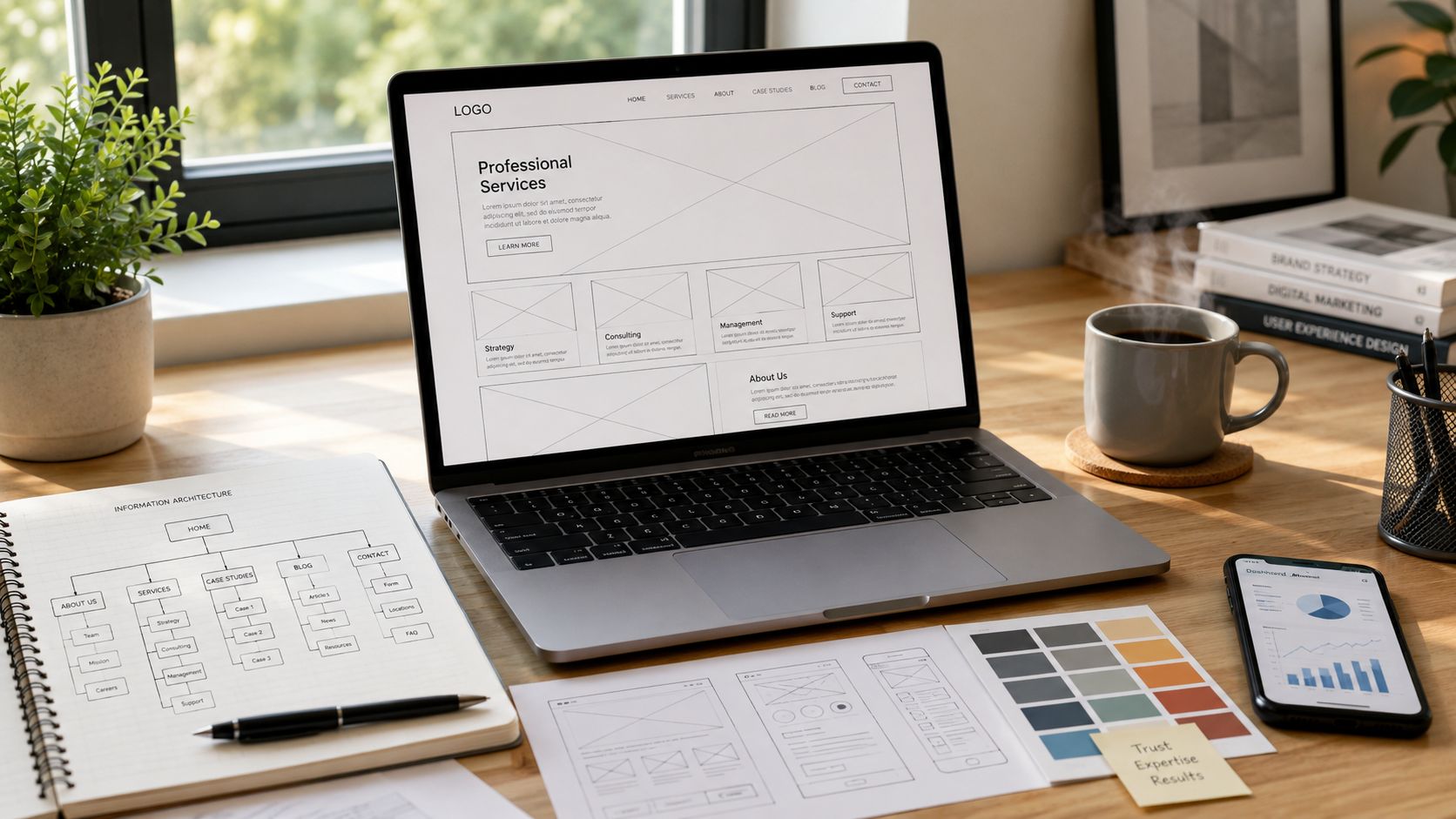
A lot of Australian professional services firms are in the same spot right now. The site looks respectable enough, the partner profiles are there, the phone number works, and nobody inside the business feels an urgent need to change it. Then the leads slow down, prospects compare three firms on mobile before lunch, and the website starts exposing a bigger problem. It isn't helping buyers decide.
That gap matters more than it used to. In a market where trust still drives buying decisions, your website has to do two jobs at once. It has to reassure a cautious buyer that your firm is credible, and it has to move that same buyer towards a measurable next step. Good professional services website design sits in that overlap. It doesn't treat branding and lead generation as competing priorities. It builds trust in a way that supports action.
Your Website Is More Than a Digital Brochure
The old brochure mindset still shows up everywhere in legal, accounting, consulting, and advisory websites. Firms load the homepage with generic claims, a stock image of a meeting room, and a contact page hidden in the navigation. That setup might have been tolerable when a website confirmed that a firm existed. It doesn't hold up when buyers are using your site to shortlist, compare, and judge risk.
Australia is a strong example of why this shift matters. The Australian Bureau of Statistics reported that 97% of households had internet access in 2021–22, up from 86% in 2016–17, which reinforces how normal digital research has become for Australian buyers and why firms need polished, mobile-friendly sites that support discovery, credibility, and lead generation, as noted in this market context summary.
When internet access is that widespread, the website stops being a passive brand asset. It becomes part of business development. Buyers expect to understand what you do, who you help, and how to take the next step without needing to call reception first.
What brochure sites get wrong
A brochure-style site usually fails in predictable ways:
- It speaks inwardly: The copy talks about the firm's history, not the client's problem.
- It hides intent: Calls to action are vague, buried, or inconsistent.
- It treats every page the same: There's no clear path from interest to enquiry.
- It confuses polish with performance: A visually refined site can still produce weak leads.
A professional services website should answer three buyer questions quickly. What do you do, why should I trust you, and what should I do next?
That's why design decisions should tie back to revenue logic. The homepage has to orient. Service pages have to qualify. Team pages have to reduce perceived risk. Contact pathways have to feel easy enough that a busy prospect will use them.
The better framing
The more useful way to think about professional services website design is as a system. It supports visibility, shapes first impressions, filters poor-fit enquiries, and creates more opportunities for high-intent prospects to raise a hand.
That also changes how firms evaluate investment. If the site is expected to contribute to pipeline, then the right benchmark isn't whether the leadership team likes the layout. It's whether the site improves qualified enquiry flow and supports downstream sales conversations. For firms that also need a broader acquisition plan, services lead generation support often works best when website structure and campaign intent are planned together, not in separate silos.
The Discovery Phase Building Your Strategic Foundation
Website projects go off course when firms skip the hard thinking and move straight into visual design. A new colour palette won't fix weak positioning. Better typography won't solve vague messaging. If the underlying strategy is muddy, the finished site will look cleaner but still underperform.
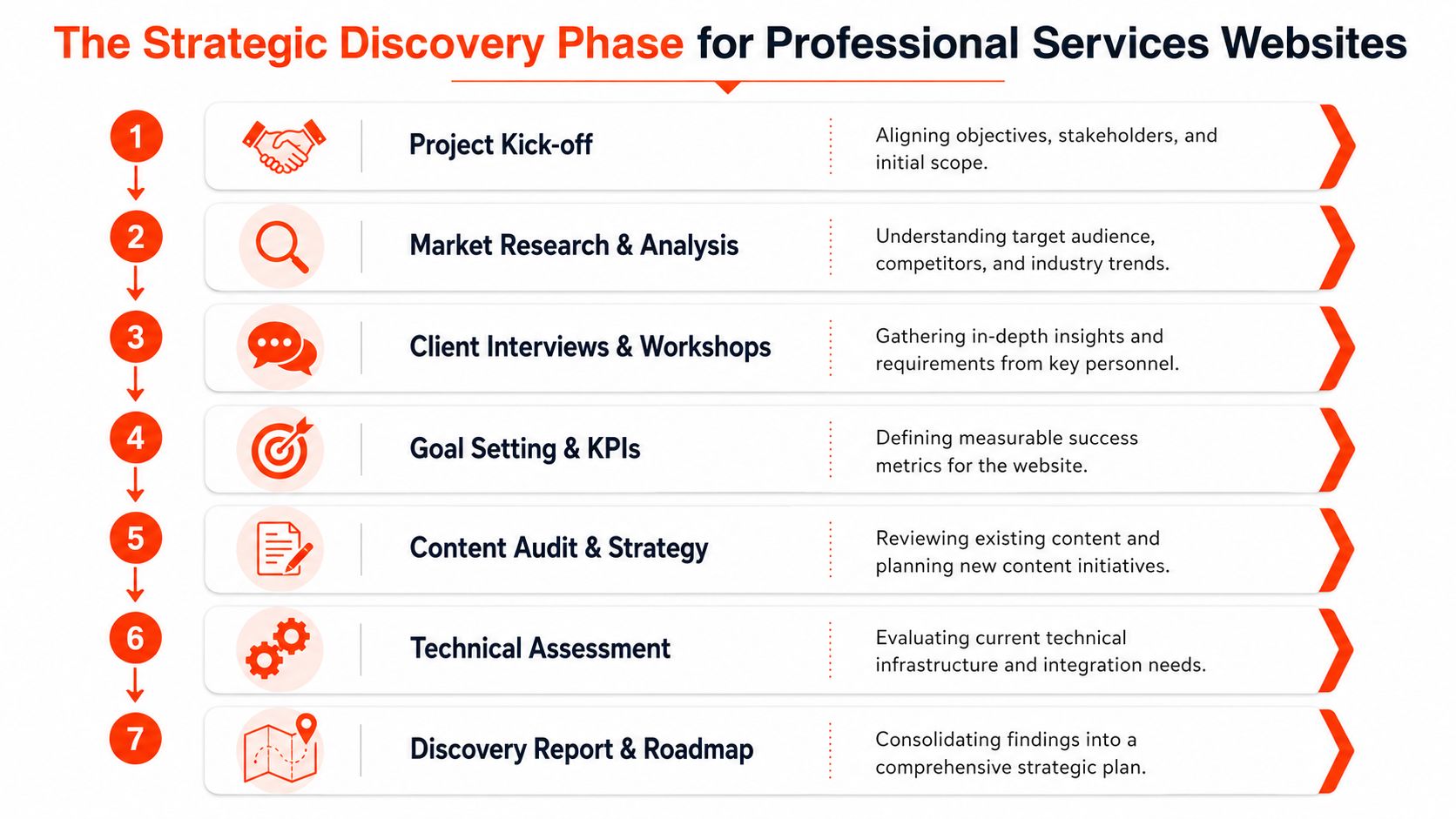
The discovery phase is where you decide what the website must do.
Start with the buyer, not the org chart
Most firms say they know their audience. Few can describe, in plain language, what a buyer is trying to resolve when they land on a service page. That's the level of clarity discovery should force.
A useful working profile includes:
-
Commercial pain points
What pressure triggered the search for help? Regulatory complexity, stalled growth, disputes, restructuring, capability gaps, internal risk, or something else. -
Decision context
Is the buyer choosing alone, building a shortlist for a partner, or validating options for a board or executive team? -
Evidence thresholds
What does this person need to see before they'll trust the firm? Depth of expertise, sector knowledge, named specialists, process clarity, or proof that similar matters have been handled before. -
Action preference
Do they want to book immediately, submit a scoped enquiry, read more first, or speak to a specialist directly?
Many firms overlook a specifically Australian gap. Guidance often talks about testimonials and clear navigation, but it rarely gets specific about how trust content and lead generation should work together across funnel stages, as discussed in Hinge's website process perspective.
Practical rule: If your team can't agree on which trust signals matter most for a first-time buyer versus a ready-to-engage buyer, the website will end up trying to show everything at once.
Set goals that can govern decisions
Once the buyer journey is clear, set website goals that will shape the build. Not abstract goals like “improve brand presence”. Real operational goals.
A strong set of website KPIs usually covers:
- Primary conversion: Consultation booking, qualified contact form submission, or direct matter enquiry.
- Lead quality: Whether the enquiries match target industries, service lines, and commercial fit.
- Page-level performance: Where users drop off before contacting the firm.
- Content support: Which pages assist conversion even if they aren't the last-click page.
These measures create discipline. They also stop internal debates from drifting into personal preference.
Review competitors like a strategist
Competitive review should go beyond “their site looks modern”. Audit what happens after the first click.
Look for:
- whether competitors use one clear CTA or several conflicting ones
- how they structure service pages
- where they place proof elements
- whether the mobile experience makes contacting the firm easy
- what kind of friction appears in forms, booking flows, or downloadable resources
The best discovery work usually ends with a short decision document. It should define target audiences, core offers, conversion goals, priority trust signals, technical constraints, and content gaps. That document does more for ROI than any homepage concept board.
Crafting Your Message and Information Architecture
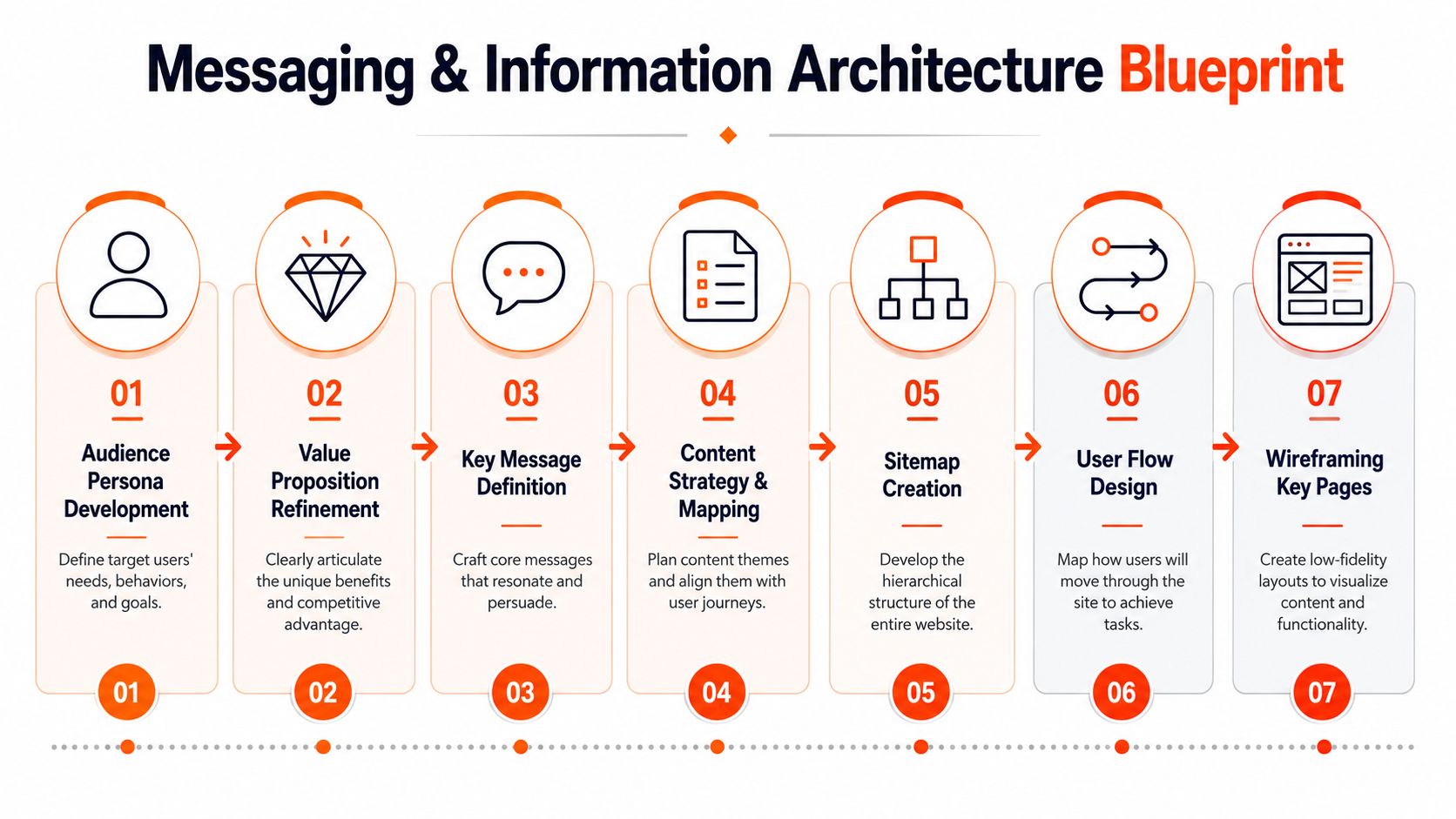
Once the strategic foundation is in place, the next challenge is making the site understandable. Many professional services firms then lose momentum. They know their expertise well, but the website describes it in broad, interchangeable language. Buyers don't respond to "bespoke solutions" or "trusted advisors". They respond when the site reflects their situation with enough precision to feel credible.
Sharpen the message before you map the pages
Strong messaging usually starts with a simple discipline. State who you help, what issue you solve, and what kind of commercial outcome you work towards. Then remove every phrase that could appear on a competitor's site without sounding out of place.
That doesn't mean every service page needs a dramatic promise. It means the copy should reduce ambiguity. A legal firm might frame a page around resolving a specific type of dispute. An accounting advisory practice might centre the page on helping founders prepare for growth, governance, or transaction scrutiny. A consultancy might focus on operational decision-making, not “transformation” as a generic label.
A useful message test is whether a prospect could forward the page to a colleague with a note that says, “This looks like the kind of firm we need.”
Build information architecture around decisions
The sitemap should reflect how buyers evaluate, not how the firm is internally organised. That often means breaking away from navigation that mirrors departments, office locations, or reporting lines.
A conversion-focused information architecture tends to work best when it includes:
- Clear service segmentation: Separate high-intent services into their own pages instead of grouping everything under one umbrella page.
- Logical supporting content: Place case examples, sector expertise, team profiles, and FAQs where they help a buyer move forward.
- One dominant action path per page: Every important page should have a primary next step.
- Predictable labels: Use plain English in menus and page titles. If clients don't use the term in conversation, rethink it.
Good information architecture reduces cognitive load. Buyers shouldn't have to interpret your firm structure before they can understand your services.
Hinge reports that professional-services redesigns typically take 4–8 months and often require 1–2 rounds of revisions, which is a useful reminder that rushed projects often skip alignment, content planning, and testing. The more meaningful benchmark is consultation-booking conversion rate and lead quality, as noted in this redesign ROI summary.
What a workable page hierarchy looks like
A practical structure for many firms includes a homepage, service pages, industry or sector pages where relevant, an about page, expert or team profiles, insight content, and a tightly designed contact or booking page.
Not every page needs equal weight. Service pages usually do the heavy lifting. Team profiles often help close confidence gaps. Insight content supports authority and search visibility. The architecture should make that hierarchy obvious.
If users can browse the site and immediately tell where to click next, the information architecture is doing its job.
Designing High-Conversion Page Templates
A high-performing professional services site is rarely won or lost at the brand level alone. It usually comes down to whether the core page templates do their specific jobs. When I review sites that aren't converting, the issue is often simple. The pages look acceptable, but they don't help a prospect move from uncertainty to action.
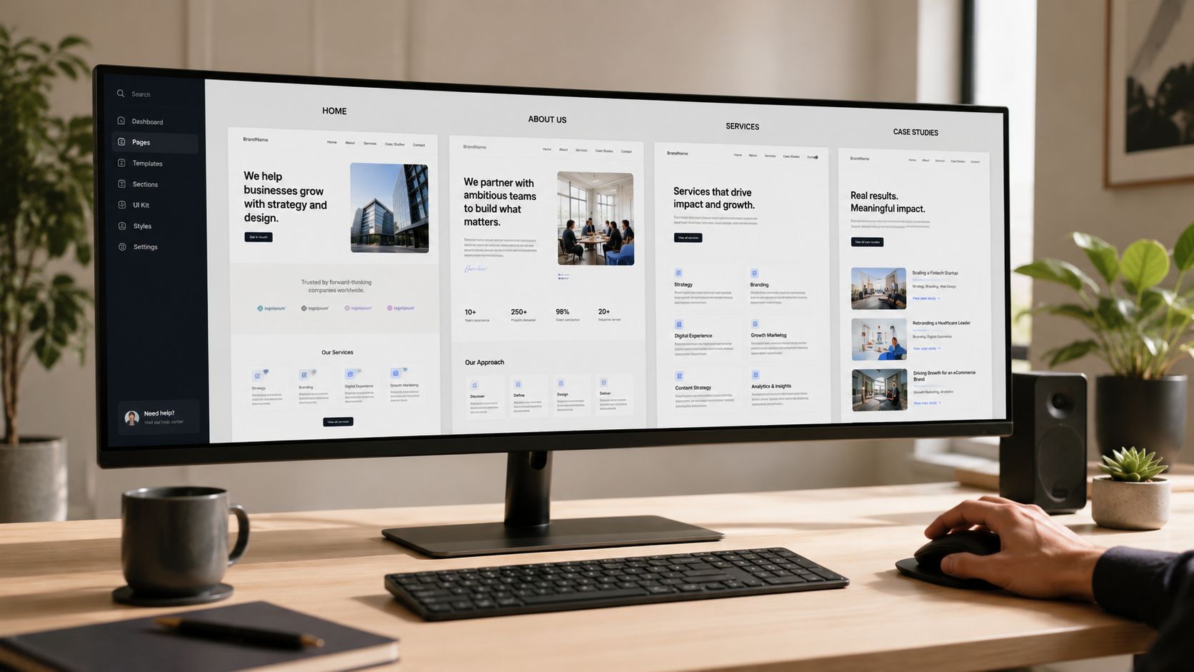
The templates that matter most are usually the homepage, service pages, about page, proof content, and contact flow.
Homepage needs to orient, not say everything
The homepage is not the place to explain the entire firm in exhaustive detail. Its job is to help the right visitor recognise relevance fast.
A strong homepage usually includes:
- a sharp opening statement that says who the firm helps and in what context
- navigation into the highest-priority services
- trust markers placed early, not buried near the footer
- a primary CTA that matches buyer intent
- a secondary path for visitors who need more confidence before contacting
For a law firm, that might mean routing users into specific matter types. For an accounting firm, it could mean splitting advisory, compliance, and transaction support clearly. For a consultancy, it often means showing industries or problem categories instead of broad capability labels.
Service pages do the commercial work
If the homepage opens the conversation, service pages usually close the gap between interest and enquiry. Buyers typically use these pages to assess suitability.
An effective service page often answers these questions in order:
| Buyer question | What the page should show |
|---|---|
| Is this relevant to my issue? | A clear problem statement and scope |
| Do they understand my context? | Industry or situational nuance |
| Can they handle this credibly? | Experience, specialists, process, proof |
| What happens next? | A direct and low-friction CTA |
This is also where mobile-first conversion design matters. Existing advice often treats mobile responsiveness as a checkbox, but Australian service firms need to rethink forms, navigation, and proof elements for buyers comparing options quickly from search or LinkedIn, as discussed in this mobile conversion article.
On mobile, long hero sections, stacked carousels, and oversized forms create friction fast. Keep the page scannable. Put the strongest evidence near the top. Use tap-friendly buttons. If a prospect has to pinch, zoom, or hunt for the CTA, the page is underperforming.
The mobile version of a service page shouldn't be a shrunk desktop layout. It needs its own content priorities.
About pages and proof pages reduce risk
The about page isn't a corporate history archive. It's where sceptical buyers decide whether the people behind the firm feel credible, commercially aware, and worth speaking to.
That usually means:
- lead with how the firm works and what clients can expect
- show real people clearly
- use bios that highlight relevant expertise, not just job titles and qualifications
- connect specialists to sectors, issues, or published insights where possible
Proof pages need similar discipline. Case studies, matter summaries, credentials, awards, speaking appearances, and articles all help, but only when organised around buyer concerns. Random proof feels decorative. Specific proof lowers perceived risk.
For teams improving page performance over time, this conversion guide for businesses is a useful companion because it helps frame testing decisions around friction, intent, and user behaviour rather than design taste alone.
A practical way to strengthen these templates is to review them through a CRO lens. That often means auditing form length, CTA hierarchy, proof placement, and mobile readability. For firms that want a more formal process, conversion rate optimisation services are one option to evaluate alongside in-house testing or specialist UX support.
A short walkthrough helps teams spot what static mock-ups miss:
Implementing Technical SEO and Performance
Many website redesigns fail after launch for a simple reason. The design improved, but the technical foundation stayed weak. A professional services site that loads slowly, renders poorly on mobile, or sends mixed signals to search engines will waste attention that was expensive to earn.
Technical SEO matters here, but it helps to frame it properly. This isn't developer housekeeping. It's part of conversion performance.
Speed changes buyer behaviour
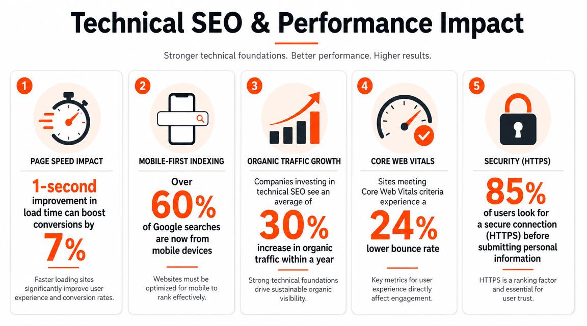
For Australian professional services sites, speed should be treated as a conversion requirement. Google's guidance highlights Core Web Vitals thresholds of LCP ≤ 2.5 s, INP ≤ 200 ms, and CLS ≤ 0.1, and Google also reports that pages loading in 1–3 s have a 32% bounce probability while 1–5 s load delays can reduce conversion probability by about 4.42% for each additional second, as summarised in this performance-focused guide.
That matters because professional services buyers often arrive with intent. They searched a specific issue, clicked from LinkedIn, or followed a referral. If the page hesitates, jumps around, or feels clumsy on mobile, you lose them before your message has a chance to work.
The technical baseline that actually matters
A practical launch checklist should cover these items:
- Page titles and meta descriptions: Unique, relevant, and written for real search intent.
- Heading structure: One clear H1, then logical H2s and H3s that support scanning and relevance.
- Internal linking: Connect service pages, team pages, and supporting insights intentionally.
- Indexation control: Make sure search engines can access the pages you want ranked and ignore duplicates or low-value utility pages.
- Image handling: Compress large files, use modern formats where appropriate, and write useful alt text.
- Security and forms: HTTPS, stable form handling, and visible trust around enquiry submission.
- Schema where appropriate: Especially for organisation, local presence, and relevant professional details.
A slow page doesn't just frustrate users. It interrupts trust at the exact moment you're asking someone to engage.
How to approach performance work
The most reliable sequence is straightforward:
- Audit current templates using PageSpeed Insights and field data.
- Identify render-blocking scripts and remove anything non-essential.
- Compress media and defer noncritical assets.
- Simplify interactions that create layout shift or sluggish input response.
- Retest on mobile before launch, not after.
The common failure mode is design teams prioritising visual effects that increase latency. Animation, video backgrounds, oversized imagery, and third-party scripts often look impressive in review meetings. They usually matter far less to buyers than clarity and responsiveness.
A technically sound site gives your messaging and design a fair chance to perform. Without that, the rest of the investment is carrying unnecessary drag.
Your Launch Checklist and Ongoing Optimisation Plan
Launch day shouldn't be treated like the finish line. For a professional services website, it's the point where assumptions finally meet real user behaviour. The firms that get better results after a redesign are usually the ones that prepare for iteration from day one.
That starts with a disciplined pre-launch process.
Pre-launch final checklist
| Check Area | Key Action Item | Status |
|---|---|---|
| Content | Confirm service pages, bios, CTAs, and legal copy are final and approved | ☐ |
| Redirects | Map old URLs to relevant new URLs to protect search visibility and avoid dead ends | ☐ |
| Forms and booking | Test every enquiry path on desktop and mobile, including notifications and thank-you pages | ☐ |
| Analytics | Configure GA4 events for key actions such as form submissions and consultation bookings | ☐ |
| Search setup | Check indexing controls, XML sitemap, robots directives, and core metadata | ☐ |
| Performance | Test mobile speed, template stability, image compression, and script loading | ☐ |
| QA | Review browser compatibility, accessibility basics, and internal links sitewide | ☐ |
What needs tracking after go-live
A new site gives you cleaner infrastructure. It doesn't automatically give you cleaner insight. If analytics hasn't been configured properly, you'll be guessing which pages produce useful enquiries and which ones only attract curiosity.
The most useful post-launch view usually includes:
- consultation or enquiry conversion by landing page
- quality review of leads by service line
- drop-off points in forms and key navigation paths
- mobile versus desktop performance patterns
- pages that assist conversions even when they aren't the final touchpoint
A common pitfall for many firms is the traffic trap. Visits may rise while lead quality stays flat. Or a page with lower traffic may be the strongest conversion assist page on the site. The point is to evaluate business outcomes, not vanity graphs.
Iteration is where ROI compounds
The most effective websites don't stay frozen after launch. Teams review recordings, heatmaps, search queries, sales feedback, and form patterns, then make targeted improvements. Sometimes the change is structural, such as simplifying navigation. Sometimes it's small, such as rewriting a CTA, reducing form friction, or moving a proof element higher on the page.
Operator's view: The first version of the website is your best informed hypothesis. The data after launch tells you where that hypothesis was wrong.
For firms that need an objective benchmark after launch, a structured website audit process can help identify where technical issues, UX friction, and conversion gaps are still holding the site back.
A website becomes a business asset when someone owns its performance after launch. Without that ownership, even a good redesign gradually slips back into brochure mode.
If your website looks polished but isn't generating the quality of enquiries your firm needs, Click Click Bang Bang can help assess where the gaps sit across visibility, conversion tracking, lead generation, and on-site performance. Learn more about Click Click Bang Bang and see whether a more structured, data-led approach to website performance fits your growth plans.
Read NeXt
Or Read Our Latest
- How to Set Up Google Ads in Australia: Complete 2026 Guide
- Google Merchant Center Setup: The Complete 2026 Guide
- Business Manager Setup Facebook: The Complete 2026 Guide
- Google Ads Account Setup: Expert Guide for 2026
- Search Ads Optimisation: A Practical Guide for 2026
- Manual vs Automated Bidding for PPC Success
Click. CLick. Subscribe.
Get our best PPC insights, industry updates, and power moves delivered straight to your inbox. No fluff, just high-caliber strategies that actually work.
Don’t Leave Just Yet
Try Us For 30-Days,
Risk Free!!
We guarantee that you’ll love our work within the first 30 days, if not you’ll get your money back.
What have you got to lose?