

What Is Pagination and Why It Matters for AU Sites
Last Updated

You're looking at a category page with hundreds or thousands of products, and the pattern is familiar. The page feels useful on desktop, then starts to creak on mobile. People tap, scroll, hesitate, and drop off before they ever reach the items you want them to see.
That's where pagination matters. It's not just a developer pattern or a tidy row of page numbers, it's a business decision about how you divide large sets of content, how people move through them, and how search engines read them. For Australian sites, especially e-commerce and lead generation, it sits right at the intersection of findability, page speed, and conversion.
Meeting the Pagination Challenge Head-On
A marketing manager opens analytics and sees a large product category losing people on mobile. The developer says the catalogue is too big to load all at once. The merchandiser wants more items visible, the SEO lead worries about crawlability, and everyone is staring at the same page with a different problem in mind.
Pagination presents a complex challenge. It may appear as a simple navigation choice, but it impacts attention, indexation, and how much friction a shopper experiences before taking action. On a site with a sprawling catalogue, a single endless list creates a very different experience compared to a structured sequence of pages, especially when the audience is on phones and moving quickly.
The useful way to think about pagination is simple. It's a way to split a large body of content into manageable chunks so users and systems don't have to deal with everything at once. The hard part is choosing whether that split helps people browse, or whether it makes them work harder than they should.
Practical rule: if a page is meant to help people compare options, pagination should support that comparison instead of hiding it.
If you're trying to assess whether your current setup is helping or hurting, start with a full-site review of how category pages, blog archives, and filtered results behave. A good audit will show whether pagination is clear, crawlable, and aligned with business goals. A useful starting point is this website audit overview, because pagination problems rarely exist in isolation.
Core Concept of Digital Pagination
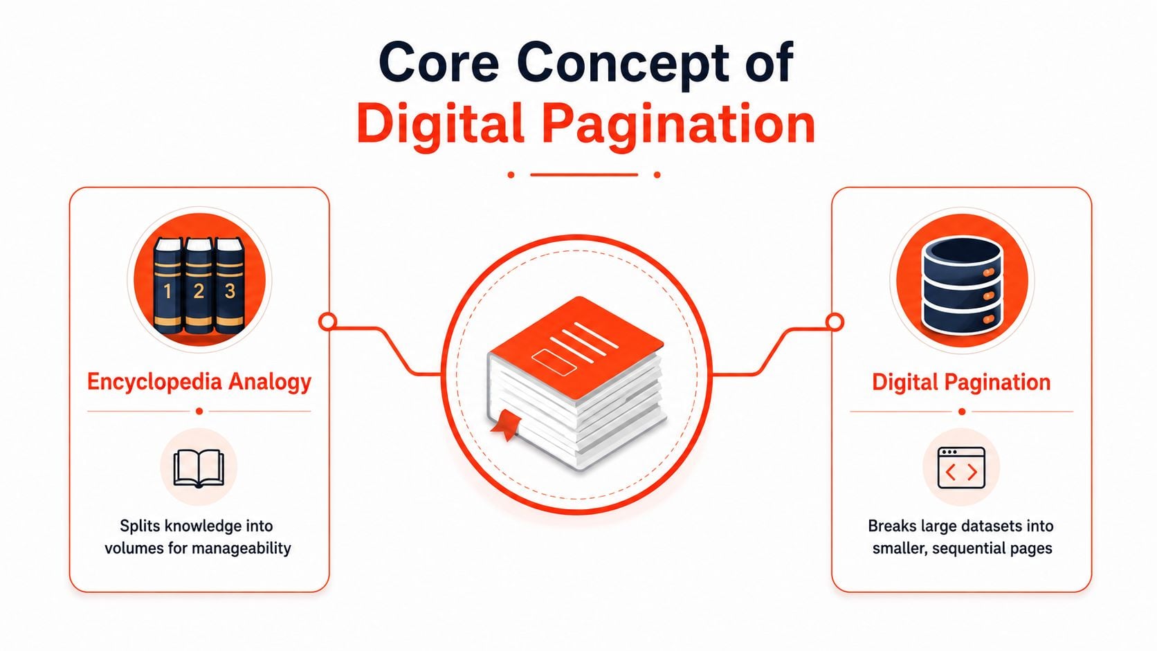
Think of an encyclopaedia. No one wants the entire set squeezed into one impossible volume, because the whole point of dividing knowledge into numbered books is making it usable. Digital pagination works the same way, except the “books” are pages in a site, app, or API response.
What pagination actually does
Pagination breaks a large dataset into discrete pages instead of loading everything in one long list. That's why you see it in search results, article archives, and API responses. The page number is just the visible layer of a deeper structure, the system is really deciding how much content to return at once.
The Australian Government Design System describes paginated content as a set of pages with a current page, and that framing is useful because it shifts the idea away from decoration and towards navigation. It's not there to look tidy. It exists because a large content set needs a predictable way for people to move through it.
A simple concept map helps here. On one side is the print idea, numbered volumes that make a big set manageable. On the other side is the digital idea, a smaller set of records or items surfaced in sequence. The link between them is continuity, each page is part of the same collection, but each page is still separate enough to load, reference, and handle cleanly.
Why it matters to both users and systems
Pagination serves two audiences at once. People need a clear way to continue browsing without losing orientation. Systems need a manageable way to serve content without sending too much data in one response.
That dual purpose is why pagination shows up everywhere from front-end interfaces to database queries. It's a usability pattern, but it's also a delivery pattern. If either side is clumsy, the experience breaks down fast.
If you're checking a site map or information architecture at the same time, it's worth comparing pagination with the broader content structure described in this sitemap guide. Pagination handles movement through a set, while a sitemap helps define the set itself. Those are related, but they solve different problems.
Print Origins and Evolution of Pagination
Pagination didn't begin on the web. Historical sources note that page numbering was rare before 1500, and that consecutive page numbering only became common around 1550, when it replaced foliation, the older practice of numbering only the front sides of folios. The word pagination itself was first recorded in English in 1835–45 Wikipedia on pagination.
That timeline matters because it changes the way we talk about the pattern. Pagination is not a modern UX invention that happened to suit e-commerce. It is a publishing convention that became standard in the mid-16th century, then later crossed into digital interfaces. The web did not create the idea, it inherited it.
Why the print history still matters online
Users arrive with expectations that were built long before e-commerce. Numbered pages imply sequence, order, and the possibility of going back or forward without losing context. That's why a “page 2” link feels familiar even to someone who's never thought about the history behind it.
For marketers, that familiarity is valuable because it reduces cognitive load. For developers, it's a reminder that numbered navigation carries a strong mental model, so changing it casually can make a product list feel less predictable. The history isn't trivia. It explains why people still trust page numbers as a way to move through a large set.
The interface works best when it respects the expectation that numbered pages represent one continuous collection.
That continuity is the important thread from print to web. The medium changed, but the human need stayed the same. People still want a structured path through a lot of information, and pagination is one of the oldest ways to give them that path.
Pagination Methods and Mobile User Behaviour
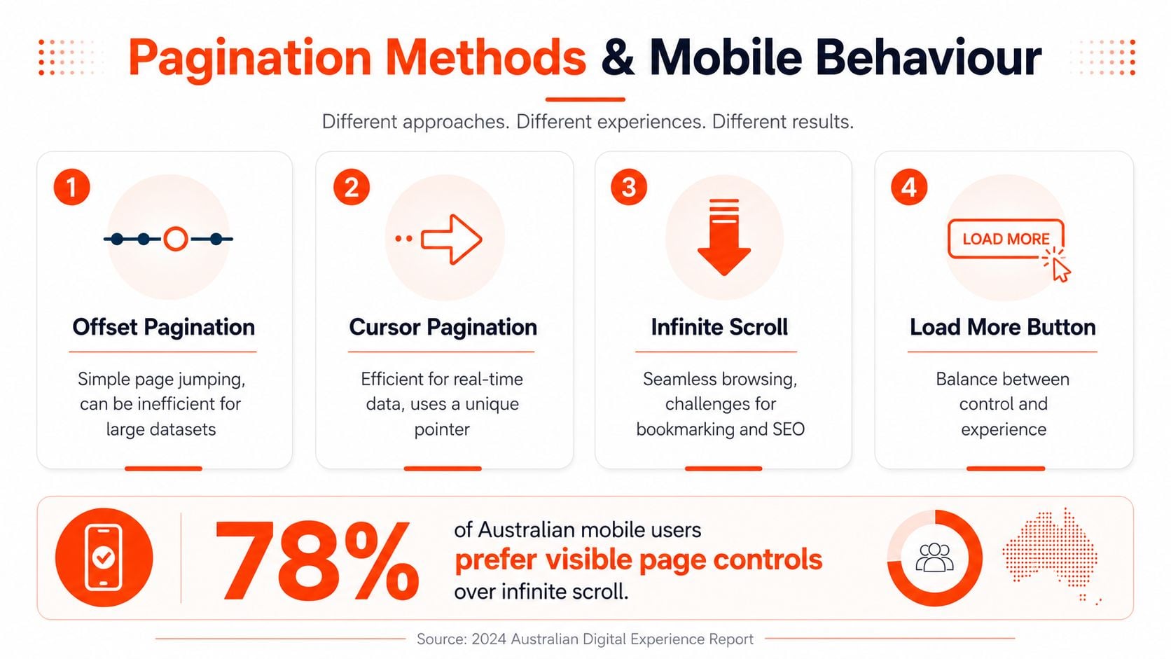
The choice isn't just “pagination or not”. Teams usually choose between offset pagination, cursor pagination, infinite scroll, and a load more button, and each one changes how people explore content. On a mobile-first market like Australia, that choice matters more because DataReportal's Australia 2025 report says there were 25.22 million internet users, 97.1% of the population was online, and 92.7% of internet users accessed the web via mobile DataReportal Australia 2025.
Four patterns, four trade-offs
Offset pagination is the familiar page-number model. It's simple to understand and easy to jump through, but it can become inefficient for very large datasets.
Cursor pagination uses a unique pointer instead of a page offset. It's often better for real-time or fast-changing data because it doesn't rely on skipping through large record sets.
Infinite scroll keeps loading content as the user scrolls. That can feel smooth, but it makes bookmarking, orientation, and some SEO workflows harder.
Load more sits between the two. It keeps some user control while reducing the jumpiness of full page refreshes.
For Australian e-commerce, the conversion question is often more important than the interface preference. A “next page” tap is a small action, but on mobile it's still friction. If people need to keep reorienting themselves, they may lose the thread of a product hunt or abandon a lead form flow before they finish.
How to choose by behaviour, not taste
A practical rule is to match the pattern to the task. Browsable catalogues with lots of comparable items often benefit from visible page controls. Fast-moving feeds and high-volume data streams can suit cursor-based approaches better. Lightweight content lists may work with load more if discovery remains clear.
If your team needs a concrete comparison of implementation styles, the load more and scrolling guidance is useful because it shows how different loading behaviours affect retrieval and interaction. It's not about scraping alone, it's a good reminder that the way content loads changes how people and systems experience it.
For design teams, this is also where layout decisions matter. Clear controls, visible sequence, and predictable movement tend to suit shoppers who want control rather than surprise. A page list that feels awkward on desktop can become far more frustrating on a small screen, so the mobile experience deserves its own test plan. For a broader design and search lens, the website design for SEO guidance is a useful companion.
SEO Best Practices for AU E-commerce Sites
Search engines treat paginated series as separate pages when a site uses a structure like ?page=n, so the technical setup needs to be deliberate. Google's guidance says paginated pages should be linked sequentially, each page should have its own canonical URL, and the first page should not be the canonical for the whole series Google pagination guidance. That's the part many teams miss, and it's where duplicate-content problems and indexing confusion can start.
What search engines need to see
Each page in the sequence should be crawlable on its own. That means no hidden-only navigation, no broken next links, and no canonical tag that collapses the whole series into page one. If page 2 or page 3 exists, search engines need to reach them directly and understand how they connect to the rest of the set.
For large Australian catalogues, link equity distribution becomes important. If the series is implemented badly, ranking signals can get trapped on the first page while deeper products become harder to discover. If it's implemented well, the category can stay organised without making the rest of the series invisible.
Why this matters for category and archive pages
Pagination is especially relevant on category pages because those pages often carry commercial intent. Users are comparing products, not reading a single article from start to finish. If the structure is unclear, the site can feel cluttered to shoppers and fragmented to crawlers.
A good technical setup keeps both audiences in mind. The URLs should be understandable, the sequence should be obvious, and the canonicals should reflect the true structure of the series. When teams skip those basics, they often end up with messy indexation and weaker page-level clarity.
If your team is trying to automate content discovery or extraction, a crawler for AI content extraction can help surface how paginated paths are presented to machines. That's useful because the same structure that helps search engines also affects how other tools traverse the site.
Examples and Implementation Checklist
A clear implementation starts with the URL pattern. A typical structure might look like /category/page/2/ or ?page=2, as long as the sequence stays consistent and each page is reachable on its own. The point isn't which syntax you choose, it's whether the pattern makes the relationship between pages obvious to users and crawlers.
A simple markup model
Here's the kind of structure many teams aim for in principle:
- Page 1: the main category URL
- Page 2: a unique URL for the second set of results
- Page 3: another unique URL for the next set
- Next/previous links: visible and easy to tap
- Canonical tag: self-referencing for each page
That approach keeps the series legible. It also makes analytics easier, because transitions between pages can be measured instead of being buried inside one very long scrolling session.
Practical rule: if a user can't tell where they are in the sequence, the pagination isn't doing its job.
Accessible labels matter too. A “Next” link should say what it does, and the controls should be large enough for mobile tapping. If the site uses numbered links, those numbers should be visually obvious and not buried under heavy styling.
Implementation checklist for teams
- Define the primary pattern: choose offset, cursor, or load more based on the content type.
- Check crawlability: make sure every page has a unique, reachable URL.
- Confirm canonicals: each page should reflect itself, not collapse into page one.
- Test on mobile: check how the controls behave on smaller screens and slower connections.
- Track transitions: measure page changes, not just total page views.
- Review stakeholder impact: SEO, design, dev, and marketing should sign off together.
That last point matters more than it sounds. Pagination looks like a front-end detail until it affects a launch, a category ranking, or a checkout funnel. Once that happens, it's no longer just a technical choice, it's a shared performance issue.
Bringing Pagination Strategy Together
Pagination isn't good or bad by default. It's a control system for large content sets, and whether it helps depends on the size of the catalogue, the device mix, and the goal of the page. A product list designed for quick comparison needs a different treatment from a blog archive or a feed that updates constantly.
For AU retailers and B2B lead-gen sites, the smartest move is to test pagination against the behaviour you care about most. If the pattern improves findability without making people work harder, it's doing its job. If it fragments attention or buries important content, it needs to be reworked.
The best teams treat pagination as a shared responsibility. SEO wants crawlable paths, developers want stable implementation, and marketers want a structure that supports conversion. When those three line up, the page stops feeling like a compromise and starts behaving like a system.
If you want a team that can audit your current pagination setup, fix the SEO details, and align it with your conversion goals, visit Click Click Bang Bang. They work across SEO and PPC with a data-driven approach, so they're well placed to help you turn pagination from a technical afterthought into a measurable growth decision.
Read NeXt
Or Read Our Latest
Click. CLick. Subscribe.
Get our best PPC insights, industry updates, and power moves delivered straight to your inbox. No fluff, just high-caliber strategies that actually work.
Don’t Leave Just Yet
Try Us For 30-Days,
Risk Free!!
We guarantee that you’ll love our work within the first 30 days, if not you’ll get your money back.
What have you got to lose?