Website Design For SEO A Modern Playbook For Success
Last Updated

Good website design for SEO is more than just making a site look pretty. It's the craft of planning and building a site that’s not only a pleasure for people to use but is also crystal clear to search engines. Essentially, it's about creating a visually appealing experience that is also technically solid, lightning-fast, and structured in a way that helps Google easily crawl, index, and ultimately rank your content.
It all comes down to building a strong foundation where great design meets smart search engine optimisation from day one.
Building An SEO-First Digital Blueprint
Long before a single line of code is written or a colour palette is chosen, the success of your website is decided by its blueprint. This foundational stage is all about creating a deliberate, strategic plan for your site’s structure, its content, and the paths users will take.
Think of it as engineering your site for search visibility from the ground up, rather than trying to bolt on SEO as an afterthought. This foresight ensures every design choice you make actively supports your goal of ranking higher and pulling in valuable organic traffic.
Map Your Information Architecture
Information Architecture (IA) is the art and science of organising your website's content to be as intuitive and findable as possible. It’s the architectural drawing for your digital home. A logical IA doesn't just help users navigate without thinking; it also gives search engine crawlers a clear map to understand how all your pages relate to one another.
To build a solid IA, start by grouping your content into logical buckets. For an e-commerce store, this might be "Men's," "Women's," and "Sale," with relevant subcategories under each. For a B2B service company, it could be "Services," "Case Studies," and "About Us." The aim is a clean, shallow hierarchy where anyone can find what they need in just a few clicks.
Create A Keyword-Driven Sitemap
Once you’ve defined your core categories, it’s time to build out a sitemap fuelled by proper keyword research. This isn't just a list of pages. It’s a strategic map where every single page is designed to target a specific set of keywords your audience is actively searching for. This process is what connects your content plan directly to user intent and search demand.
- Core Service/Product Pages: These need to target your main commercial keywords (e.g., "PPC agency Melbourne").
- Supporting Blog Content: This is where you target informational keywords and long-tail questions (e.g., "how to improve Google Ads conversion rate").
- Location Pages: If you're a local business, these are non-negotiable for targeting geo-specific terms (e.g., "SEO services Sydney").
This blueprint starts with the sitemap and content plan as the two core pillars of the entire project.
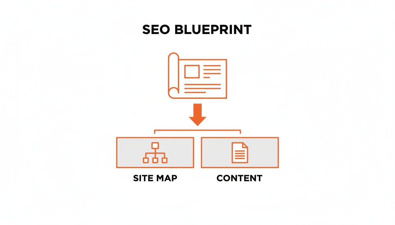
This visual shows that a successful SEO-focused website design starts with a well-thought-out sitemap and a content strategy. Together, they form the foundation for everything else.
Analyse Your Competitors For An Edge
A seriously powerful tactic during the blueprint phase is to pick apart your top-ranking competitors. Get into the weeds of their website structure. How do they organise their services? What categories are they using in their main navigation? This kind of analysis can uncover opportunities you might have missed and even highlight structural weaknesses in their approach that you can exploit.
Don’t just copy what your competitors are doing. Instead, look for the gaps in their content and site structure. If they’re missing a dedicated resources hub or their blog is a disorganised mess, that’s your opening to build a better, more helpful user experience that Google will reward.
Keeping an eye on major algorithm shifts like Google's Helpful Content Update is also critical. When you understand what search engines value—like genuinely helpful, user-first content—you can build a blueprint that’s not just competitive now but is also resilient enough to handle future updates.
Mastering Mobile First Design And Page Speed
When we talk about website design for SEO these days, it all starts with mobile. It’s no longer about having a desktop site that just works on a phone; you have to design for the smallest screen first and then scale up. This is the heart of a true mobile-first philosophy.
Thinking this way forces you to get ruthless about what’s important. On a small screen, there's zero room for clutter or slow-loading fluff. Every single element needs a purpose, making the user journey direct and efficient. The bonus? This focus naturally creates a cleaner, faster experience across every device.

Embrace True Responsive Design
Responsive design isn’t just about making things shrink to fit. A truly effective responsive site considers the unique context of how people use their phones.
Here’s what that looks like in practice:
- Generous Touch Targets: Buttons and links need to be big enough to tap easily without frustrating, accidental clicks. We've all been there, trying to hit a tiny link with our thumb—it's an instant user experience killer.
- Perfect Legibility: Fonts must be readable without pinching to zoom. This means using high-contrast colour schemes and ensuring your typography scales correctly on different screens.
- Simplified Navigation: Those complex, multi-layered menus from desktop sites are a nightmare on mobile. Go for a clean "hamburger" menu or a simple, sticky navigation bar that prioritises the most important actions.
This mobile-first mindset is absolutely critical. For example, when crafting a high-converting landing page, the mobile experience dictates your entire layout, from where you place your call-to-action to how the content flows. You can see how these principles play out in our guide on how to create a landing page.
Why Page Speed Is Your Secret Weapon
A mobile-first design almost always leads to a faster website, and page speed is one of the most critical ranking factors there is. A slow site doesn't just annoy users; it sends a clear negative signal to Google, which directly hurts your rankings.
The numbers are pretty stark. A shocking only 30% of Australian small business websites pass basic speed tests. When you consider that 93% of Australians search online for local businesses, a sluggish site makes you practically invisible. Shaving just two seconds off your load time can give you a major conversion boost—vital in Australia's mobile-first market.
Beyond just being responsive, optimising for page speed is a non-negotiable part of both user experience and SEO. For some solid starting points, this guide on improving website speed has some great, practical steps.
Understanding Core Web Vitals
To really hammer home the importance of user experience, Google introduced Core Web Vitals. These are specific, measurable metrics that score a user’s real-world experience on your site. The kicker? They are direct ranking signals, meaning poor scores will absolutely hold you back.
The three main metrics to watch are:
- Largest Contentful Paint (LCP): This measures how fast your main content loads. It’s the point when a user feels like the page is actually ready.
- First Input Delay (FID): This measures how quickly your page responds to a user's first interaction, like a click or a tap.
- Cumulative Layout Shift (CLS): This measures visual stability. It catches those annoying moments when elements on the page jump around as it loads.
Your goal is a "Good" score across all three Core Web Vitals. This isn't just about appeasing Google. It’s about giving people a smooth, frustration-free experience that makes them want to stick around, engage, and ultimately convert.
To give you a clearer target, here’s what Google considers good, needs improvement, or poor performance.
Core Web Vitals Performance Benchmarks
This table breaks down the thresholds for each of the Core Web Vitals. Aim for the "Good" column on every single one.
| Metric (Core Web Vital) | Good Score | Needs Improvement | Poor Score |
|---|---|---|---|
| Largest Contentful Paint (LCP) | ≤ 2.5 seconds | > 2.5s and ≤ 4.0s | > 4.0 seconds |
| First Input Delay (FID) | ≤ 100 milliseconds | > 100ms and ≤ 300ms | > 300 milliseconds |
| Cumulative Layout Shift (CLS) | ≤ 0.1 | > 0.1 and ≤ 0.25 | > 0.25 |
Getting into that "Good" category for all three isn't an accident; it takes focused technical effort.
A few key optimisation techniques include:
- Optimising Images: Compress your images without losing quality and use modern formats like WebP.
- Minifying Code: Strip out all the unnecessary characters from your HTML, CSS, and JavaScript files to shrink their size.
- Leveraging Browser Caching: Tell users' browsers to store parts of your site, so they don’t have to re-download everything on their next visit.
- Using a Content Delivery Network (CDN): Spread your content across servers around the world to cut down load times for visitors who are far away from your main server.
By building these speed tactics right into your mobile-first design process from the beginning, you’ll end up with a website that both users and search engines will love.
Ensuring Your Site Is Crawlable And Indexable
You could have the most visually stunning website in the world, but if search engines like Google can’t find, crawl, and understand it, it’s basically invisible. This is where the technical side of website design for SEO becomes absolutely non-negotiable.
It’s all about laying down a clear, logical path for search engine bots so they can efficiently navigate your pages and add them to their massive library—the index. Without this foundational work, all the effort you pour into beautiful design and compelling content is wasted. A site that isn’t crawlable simply won’t rank.

Giving Search Bots Clear Instructions
First things first: you need to provide clear directives for search engine crawlers. Think of these as the official rules of engagement for your site, telling bots exactly where they can and can’t go.
Your main tool here is the robots.txt file. It’s a simple text file that lives in your site's root directory and gives instructions to web robots. You can use it to block crawlers from private admin areas, thank-you pages, or internal search results. This stops them from wasting their limited crawl budget on pages you don’t want indexed anyway.
Working alongside this is your XML sitemap. This file is a complete roadmap of every important page on your site that you do want search engines to discover. Submitting this sitemap via Google Search Console is like handing Google the keys to your kingdom, ensuring it knows about all your valuable content.
Crafting Clean URLs and Internal Links
How you structure your URLs and link between pages is hugely important for both users and SEO. Every URL should be clean, descriptive, and easy to read.
A good URL structure gives context at a glance. For instance, yourstore.com.au/mens-shoes/leather-boots is far more effective than a messy URL like yourstore.com.au/cat?id=123&prod=456. The first one is instantly understandable and even includes relevant keywords.
This same logic applies to your internal linking strategy. By linking relevant pages to one another, you build a logical pathway that helps search engines understand the relationships between your content. This process also distributes "link equity"—or authority—throughout your site. A well-linked page passes some of its SEO value to the pages it links to, strengthening your overall site architecture.
Internal linking is one of the most underrated parts of on-page SEO. A strong internal linking structure helps establish site hierarchy, spread ranking power, and guide users to your most important pages. Best of all, it’s a powerful signal you can completely control.
Managing Duplicates And Crawl Errors
As any website grows, technical gremlins are bound to pop up. Proactively managing them is crucial for maintaining a healthy SEO profile.
One of the most common issues is duplicate content. This can happen for all sorts of reasons, like having printer-friendly versions of a page or e-commerce filters that create multiple URLs for the same product list. The solution is using canonical tags. A canonical tag is a snippet of HTML code that tells search engines which version of a URL is the "master copy," consolidating all SEO signals to a single page.
You also need to stay on top of crawl errors. Regularly check Google Search Console for issues like:
- 404 Errors (Page Not Found): These pop up when a page is deleted or a URL changes. If the old page had valuable backlinks, you must implement a 301 redirect to a relevant, live page to preserve that authority.
- Redirect Chains: This happens when one page redirects to another, which then redirects to a third. These chains slow down your site and dilute link equity. They need to be cleaned up by pointing the initial URL directly to the final destination.
Maintaining a technically sound site isn't a one-and-done job; it's an ongoing process. Running regular checks is key to catching and fixing issues before they drag down your rankings. For a deeper dive, a complete audit can uncover any hidden problems—our guide to technical SEO auditing is a great place to start.
Weaving On-Page SEO Into Your Design
I see it all the time: a beautifully designed website that's an absolute ghost town when it comes to search traffic. The problem? SEO was treated as a sprinkle of magic dust to be added after the fact.
Truly effective website design for SEO doesn’t work like that. It's not about slapping keywords onto a finished page. It’s about building page templates that are engineered to rank from the moment they go live. On-page SEO isn't an afterthought; it’s a core component of the design process itself.
When you weave SEO elements directly into your templates, you create a scalable system. Every new page—whether it’s a product listing, a service page, or a blog post—is fundamentally optimised by default. This approach saves a ton of time down the line, prevents common errors, and signals consistent relevance to search engines across your entire site.
Design with Core SEO Elements in Mind
Every page template you create should have clearly defined, visually distinct spaces for the foundational elements of on-page SEO. Your design should almost trick content creators into doing the right thing without them even realising it.
This means you need to strategically place and format:
- Title Tags & Meta Descriptions: While they're not visible on the page, your CMS template must have prominent, easy-to-use fields for these. They're your digital billboard in the search results, and getting them right is critical for click-through rates.
- Header Tags (H1, H2, H3): A logical heading hierarchy is non-negotiable. Your design must enforce one, and only one, H1 tag per page, styled as the main page title. Subheadings (H2s and H3s) should be visually distinct to break up content and create a scannable structure that helps both users and search crawlers quickly grasp the page's main topics.
- Image Alt Text: Every single image placeholder in your templates needs a required field for alt text. This isn't just an accessibility feature (though that's hugely important); it’s a prime opportunity to tell search engines what an image is about, helping you rank in image search.
Designing for SEO means making it impossible to forget the essentials. If the H1 is the most prominent text element on the page and alt text is a mandatory field in your CMS, you're building a system that reinforces SEO best practices by default.
This structured approach transforms SEO from a boring checklist item into an integrated part of your content workflow.
Create Templates Tailored to User Intent
Different pages serve different purposes, and their designs absolutely must reflect that. A one-size-fits-all template just doesn't cut it. Why? Because a person searching for a product has a completely different intent than someone looking for a "how-to" guide.
For example, an e-commerce product page template should feature prominent sections for high-resolution images, customer reviews, detailed specifications, and a clear call-to-action. On the other hand, a B2B service page needs space for client testimonials, case study links, and lead-capture forms. And a blog post template? It demands a clean, readable layout with plenty of white space and clear subheadings to make scanning easy.
When you design for intent, you naturally create a better user experience. This leads to higher engagement signals—like longer time on page and lower bounce rates—that Google absolutely loves to see.
A Practical On-Page SEO Template Checklist
To make sure your designs are primed for performance right out of the gate, it helps to have a checklist. This ensures you're building flexible yet consistent templates that cater to the specific user intent for each page type. Think of it as a blueprint for your most important pages.
Here's a simple comparison to guide you.
On-Page SEO Template Checklist
| On-Page Element | E-commerce Product Page | B2B Service Page | Blog Post |
|---|---|---|---|
| Primary Keyword Goal | Transactional (e.g., "buy leather boots") | Commercial (e.g., "ppc agency sydney") | Informational (e.g., "how to improve ad copy") |
| H1 Tag Strategy | Product Name | Service Name + Benefit | Compelling, Keyword-Rich Headline |
| Key Content Layout | Images, Specs, Reviews, CTA | Testimonials, Case Studies, Form | Subheadings, Lists, Helpful Content |
| Image Alt Text | Descriptive product name + features | Service in action, team photos | Explanatory screenshots, diagrams |
| Internal Linking | Link to related products, categories | Link to case studies, contact page | Link to related posts, service pages |
Integrating these SEO considerations directly into your design phase is the secret to building a website that doesn't just look good but performs exceptionally well in search. It’s about creating a framework where every piece of content you publish has the best possible chance to rank and attract the right audience from day one.
Gaining An Edge With Structured Data And Hreflang
To really get a leg up on the competition, you need to go beyond standard on-page SEO. It’s about giving search engines a much deeper, more nuanced understanding of your content. This is where you can speak directly to search bots in their language, providing extra context that helps them classify and feature your content in powerful ways.
This advanced layer of website design for SEO comes down to two key tools: structured data, which helps you earn those eye-catching rich snippets, and hreflang tags, which are non-negotiable for any business operating across different countries or languages.

What Is Structured Data?
Structured data, usually implemented with Schema.org vocabulary, is essentially a way to label your content for search engines. You’re not just telling them you have a product; you’re explicitly telling them its price, availability, and customer rating in a standardised format they can easily digest.
This extra information allows Google to display your pages as rich snippets in the search results—those enhanced listings with star ratings, event dates, or recipe cooking times. These visually engaging snippets can dramatically improve your click-through rates, even if your ranking doesn't budge.
While implementing schema can get technical, many modern CMS platforms and plugins have made it much simpler. When you’re in the design phase, think about building these common schema types right into your page templates:
- Product Schema: Absolutely essential for e-commerce. It feeds Google information like price, stock status, and reviews.
- Review Schema: Perfect for service pages and product listings, this displays those all-important aggregate star ratings.
- Article Schema: Used for blog posts and news, highlighting the headline, author, and publication date.
- LocalBusiness Schema: Critical for local SEO. This provides the address, opening hours, and phone number that can appear in the Local Pack.
By designing your page templates with structured data in mind from the start, you ensure that every new piece of content you publish is automatically marked up for rich snippet eligibility. This builds a huge competitive advantage over time.
Expanding Your Reach With Hreflang
If you're targeting customers in different countries or who speak different languages, simply translating your content isn’t enough. You need to explicitly tell search engines which version of a page should be shown to which user. This is exactly what hreflang tags are for.
An hreflang tag is a small piece of code in your page’s <head> section that signals the language and, optionally, the geographic region a page is intended for. For instance, you can specify one page for English speakers in Australia (en-AU) and another for English speakers in the United Kingdom (en-GB).
This simple tag prevents search engines from flagging your different language versions as duplicate content. More importantly, it ensures that users in Sydney land on your Australian site, not your American one. Getting this right is crucial for a relevant user experience and maximising your international SEO performance.
Designing a Site for Multiple Locations
Beyond just language, a smart website design for SEO needs to consider how to structure a site to target multiple geographic locations—whether that’s different cities within Australia or different countries around the globe. This is a powerful growth strategy that many businesses overlook.
The impact of geo-targeting is immense. In fact, one Australian study found that businesses targeting multiple locations can receive 557% more organic traffic than those focused on a single spot. This highlights the incredible potential of designing a site with local or international expansion built into its DNA. You can dig into these findings over at Websites That Sell.
There are a few common ways to structure your site for this, each with its own pros and cons:
- Country-Code Top-Level Domains (ccTLDs): Using domains like
yourbusiness.com.auandyourbusiness.co.nz. This sends the strongest possible geographic signal to search engines but means you have to manage multiple, separate websites. - Subdomains: Using
au.yourbusiness.comandnz.yourbusiness.com. This is generally easier to manage than separate ccTLDs, though it’s considered a slightly weaker geographic signal. - Subdirectories: Using
yourbusiness.com/au/andyourbusiness.com/nz/. This is often the easiest approach to set up and maintain. It keeps everything on a single domain while still allowing for clear geo-targeting when combined with hreflang tags and settings in Google Search Console.
The right choice really depends on your resources and long-term business goals. However, planning for this structure during the initial design phase will save you from a massive technical headache and migration project down the road.
Common Questions About Website Design And SEO
When you're trying to merge beautiful design with smart search engine optimisation, it’s natural for questions to bubble up. The whole process can feel a bit complex, especially when you're weighing up aesthetics against technical performance. Let's clear the air and tackle some of the most frequent queries I hear from clients.
How Long Does It Take For SEO Design Changes To Work?
Ah, the classic "how long is a piece of string?" question. While there's no single answer, I can give you some realistic timeframes based on what I’ve seen over the years. How quickly your website design for SEO efforts pay off really depends on your site's age and authority, how fierce the competition is, and just how big your changes are.
- Quick Wins (Technical Fixes): Things like fixing crawl errors, boosting site speed, or rolling out structured data can show results surprisingly fast. You might see a positive shift in as little as a few weeks, as Google gets around to re-crawling and re-indexing your pages.
- The Long Game (Content & Structure): If you're overhauling your information architecture or launching a whole new content strategy, you need to be more patient. It typically takes 3-6 months to see real momentum. Search engines need time to understand the new site structure, and your content needs time to build authority.
Honestly, patience is the name of the game here. SEO is a long-term investment, not a magic wand.
Can I Use A Website Template Or Do I Need A Custom Design?
This is a huge dilemma for many businesses, especially those just starting out. The right choice really comes down to your budget, your goals, and how comfortable you are with the technical side of things.
Website templates have come a very long way. A good template from a reputable provider is often built with SEO best practices baked right in—they're usually mobile-friendly, have clean code, and let you customise the basics. For a lot of startups and small businesses, a well-chosen template is a perfectly smart and cost-effective way to get started.
On the other hand, a custom design gives you complete freedom. It lets you build a site that’s perfectly moulded around your unique customer journeys, content strategy, and specific technical needs. If you're swimming in a highly competitive pond or have complex features in mind, a custom build can give you a serious performance advantage.
The real decider isn't template vs. custom. It's about execution. A poorly optimised custom site will get crushed by a well-managed template site every single time.
How Often Should I Redesign My Website For SEO?
The days of tearing down your website every two or three years for a complete overhaul are well and truly over. That old approach is disruptive, wildly expensive, and often torpedoes your SEO progress by hitting the reset button.
Today, the smart money is on iterative improvement.
Instead of huge, infrequent redesigns, you should be constantly testing, tweaking, and refining your website. This could look like:
- A/B Testing: Always testing different headlines, calls-to-action, or page layouts to see what improves your conversion rates.
- Updating Page Designs: Refreshing key service or product pages based on what user data from heatmaps and analytics is telling you.
- Refining Technical SEO: Regularly tackling Core Web Vitals, optimising images, and keeping your code clean.
This agile approach keeps your site fresh and in sync with what your users want, all without the massive risk of a full redesign. Think of your website less like a static brochure that needs reprinting and more like a living, breathing thing that evolves over time.
At Click Click Bang Bang, we build websites with a performance-first mindset, ensuring every design choice supports your SEO and PPC goals from day one. If you're ready for a site that doesn't just look good but drives real business growth, let's talk. Learn more about our approach at https://clickclickbangbang.com.au.
Read NeXt
Or Read Our Latest
- SEO Cost Australia 2026: Your Guide to Pricing
- Offline Conversion Tracking: Guide for AU Businesses 2026
- How to Start Advertising on LinkedIn: 2026 Guide
- 7 B2B LinkedIn Ad Examples to Steal in 2026
- 7 Best Google Ads Managers in Australia for 2026
- Customer Data Platform Guide: Boost ROI & Meet AU Privacy
Click. CLick. Subscribe.
Get our best PPC insights, industry updates, and power moves delivered straight to your inbox. No fluff, just high-caliber strategies that actually work.
Don’t Leave Just Yet
Try Us For 30-Days,
Risk Free!!
We guarantee that you’ll love our work within the first 30 days, if not you’ll get your money back.
What have you got to lose?